IRS Online Account is a private and secure web app serving millions of U.S. taxpayers. It provides the ability to see account status, inspect tax balances, make tax payments, and much more.
The Team
Under the management of OLS (Office of Online Services), the Online Account product team was composed of several designers, researchers, developers, 508 specialists, project leads, business analysts, a product manager, and the product owners.
My Role
As a consultant to the federal government, I served as Lead UX Designer for Online Account. I was responsible for overseeing my team's design work, managing their capacity, and contributing to the redesign effort.
SAFe
The product team followed scaled-agile methodologies. I met with core team members several times a week facilitating design reviews and participating in various agile ceremonies.
The Challenge
In response to the 2019 Taxpayer First Act, The IRS put in place a new strategy that would modernize much of their legacy systems and improve the overall user experience of their public-facing digital platforms, including Online Account.
The Account experience was fraught with user pain points and frustrations and was quickly developing a backlog of UX and technical debt.
The IRS needed a solution that would:
- Allow the application to scale and grow with newly planned features and enhancements and
- Improve the usability and accessibility issues discovered during research
Online Account first launched in December 2016 as an SPA (Single Page Application).
Discovery & Ideation
Design/Discovery Workshop
I helped co-facilitate a few design workshops with our product lead in the early stages of this initiative. Three core ideas emerged during these brainstorming sessions:
- We needed to revisit the information architecture and introduce site navigation.
- We needed to improve the readability of the account status and make it more clear.
- We needed a mobile-friendly and performant web application.
Research Gathering
User personas, Foresee survey data, journey maps, and other research reports were utilized to help me better understand the target user's needs, goals, and behaviors.

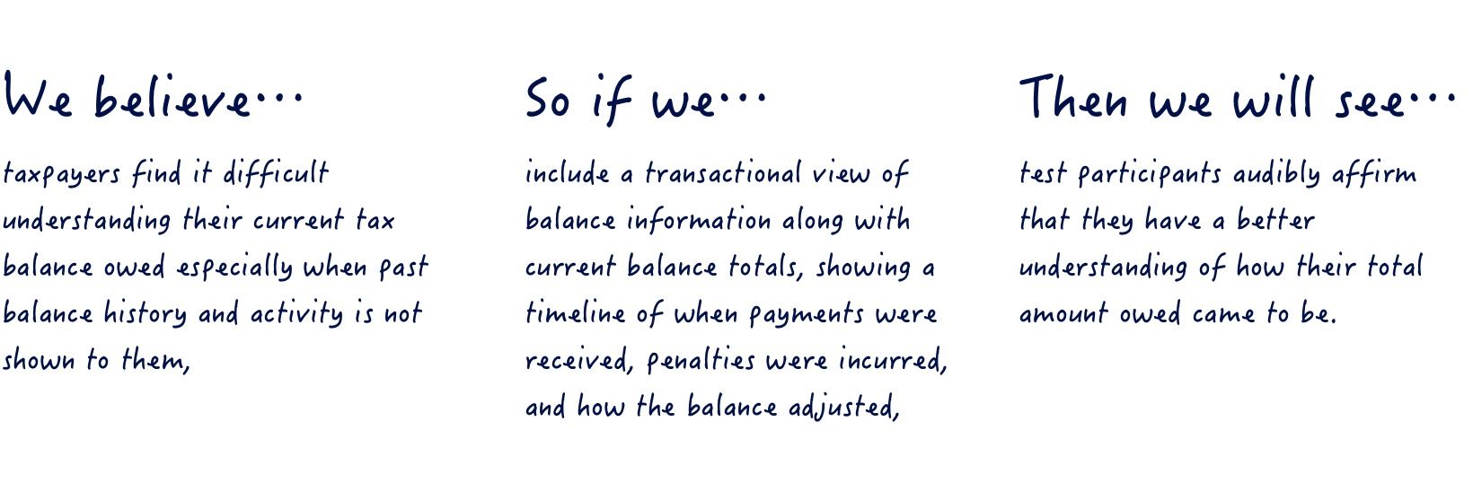
Design Hypotheses
The OLA UX team began to incorporate a hypothesis-driven design practice. I was responsible for writing and communicating several design hypotheses that would be instrumental in helping us validate our core assumptions and beliefs.
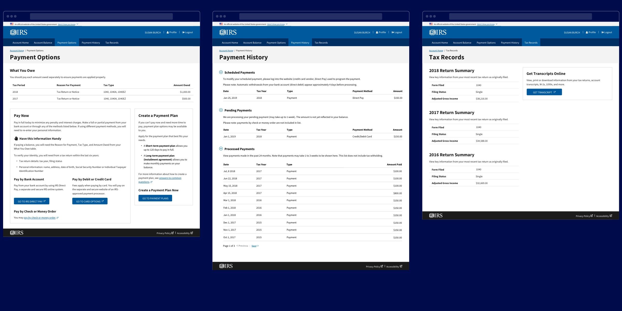
Introducing Site Navigation & Information Architecture
The SPA had outgrown its current design. We needed a solution that would allow more content and features to be added to the application without breaking the current user experience. We explored and tested multiple navigation mechanisms and taxonomy models.
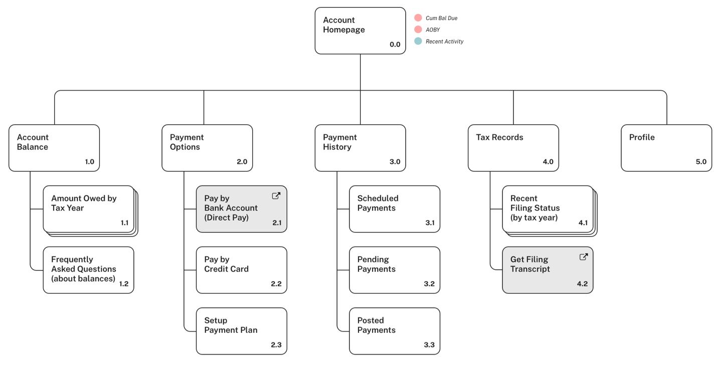
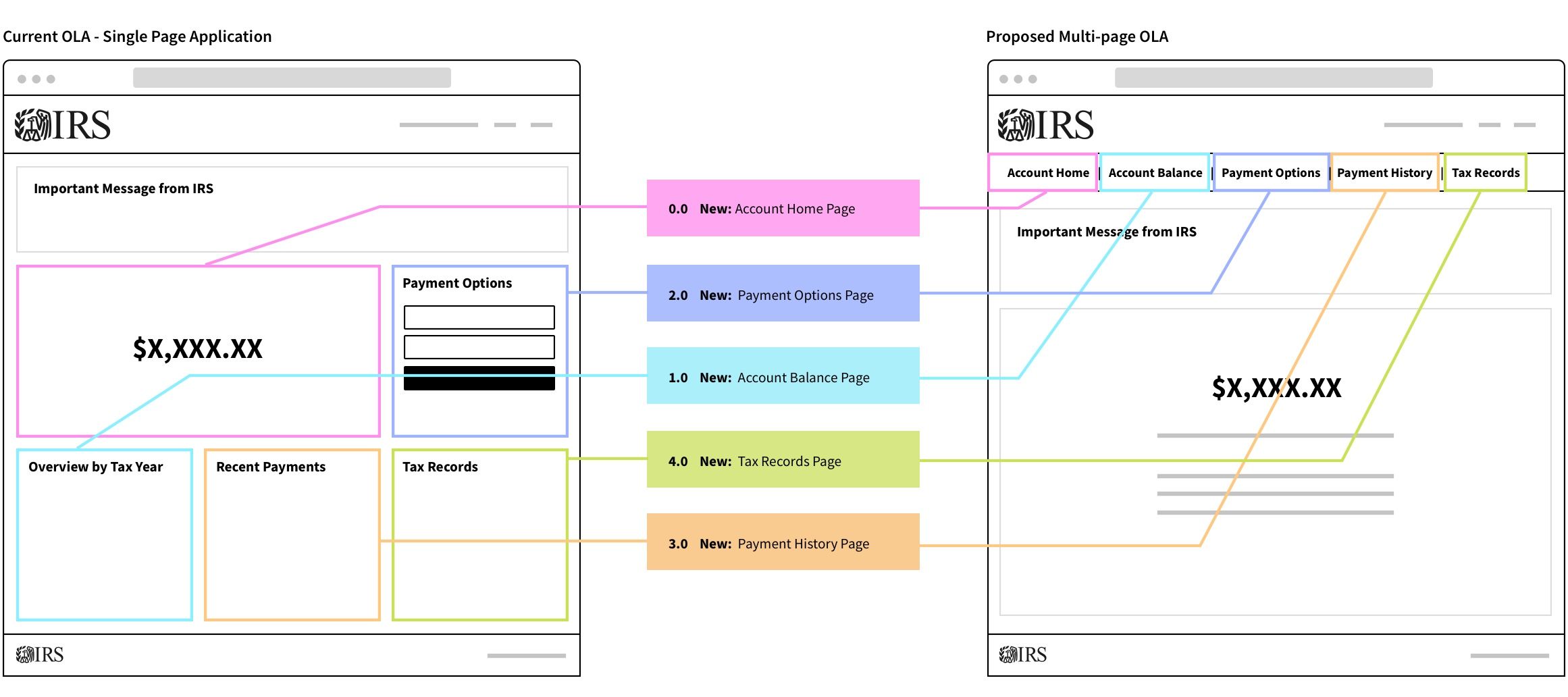
I created this diagram to help articiulate to key stakeholders how the homepage content would port to new tabs within the multi-page application.
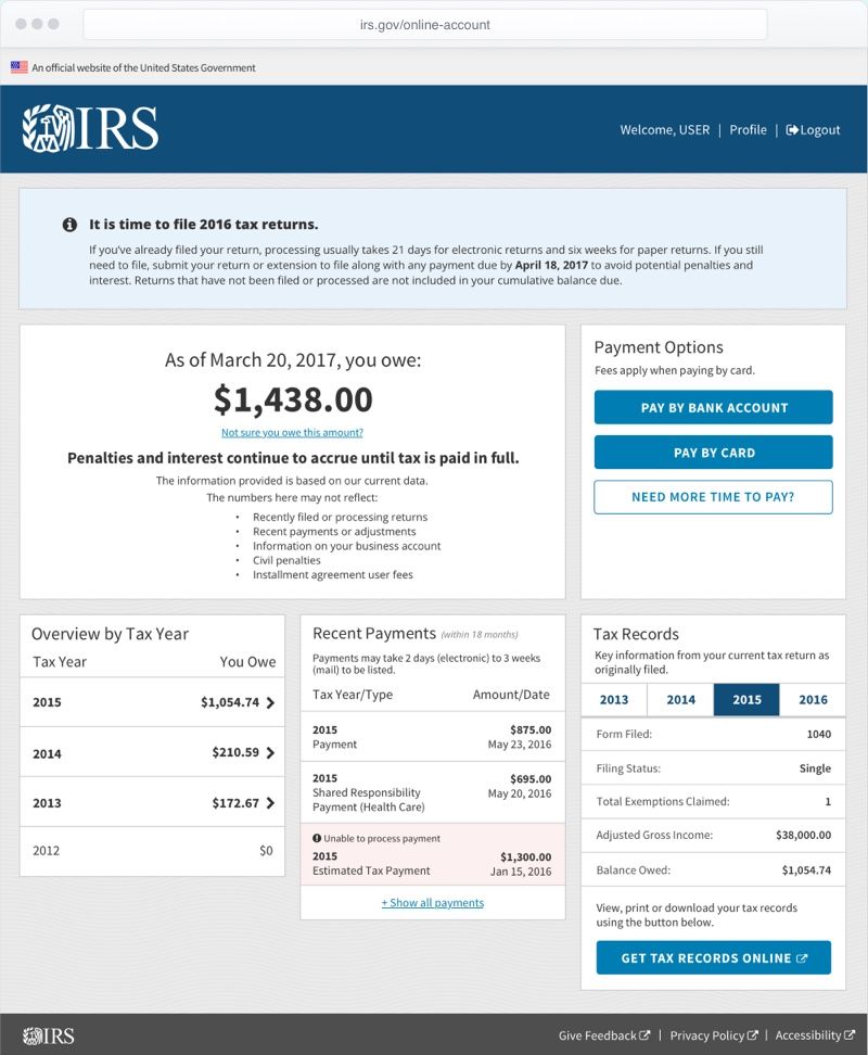
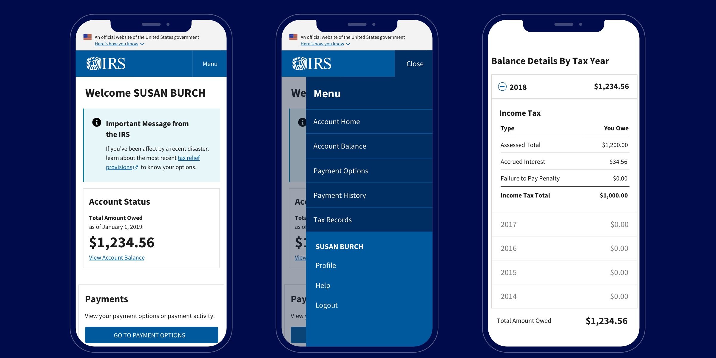
Improving Account Status & Balance Info
A consistent finding from our user research revealed that taxpayers desired straight-forward, plain-language understanding of their account status with the IRS. For those taxpayers who owed a balance, it was critical they understand how their balance came to be.
Our solution for this was two-fold:
- reduce the content presented on the homepage and communicate only the essential account status information,
- improve the way balance information is presented to the taxpayer using a transactional view that shows how the balance evolved over time (via debts and credits)
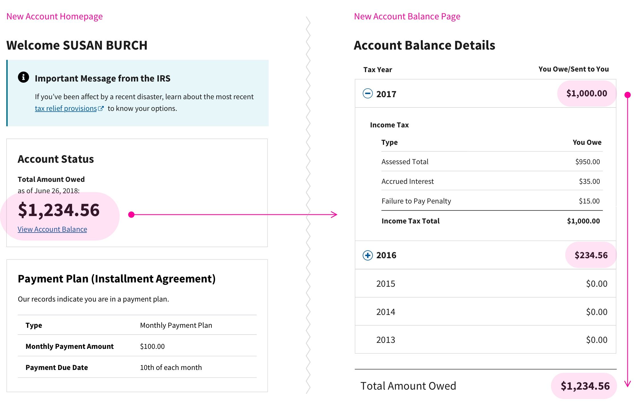
On the left: Only critical account status info on homepage (with link to balance detail breakdown). On the right: Transactional display of balance information reduces the cognitive math a taxpayer often undergoes when attempting to understand their balance.
Making Online Account Mobile-Friendly
Online Account was not mobile-friendly and very difficult to use. While we had explored making improvements to the native application (IRS2Go), user research revealed taxpayers preferred the convenience and consistency of using the web application as long as it was secure and private.
In response to this, we changed our design approach to be mobile-first and worked with the business in writing more mobile-friendly content and messaging.
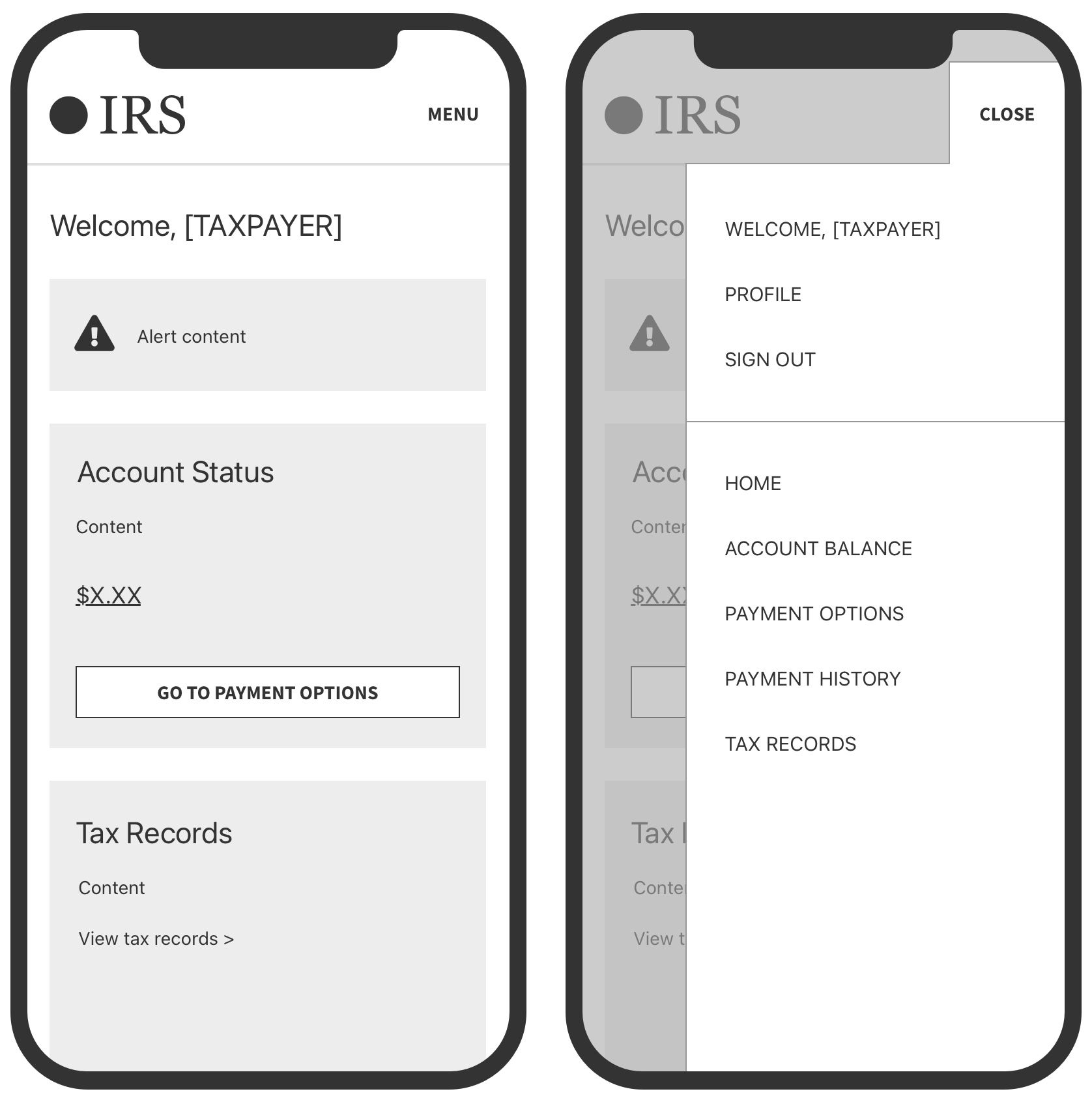
I created low-fidelity wireframes to illustrate the new mobile-experience and mobile navigation plan.
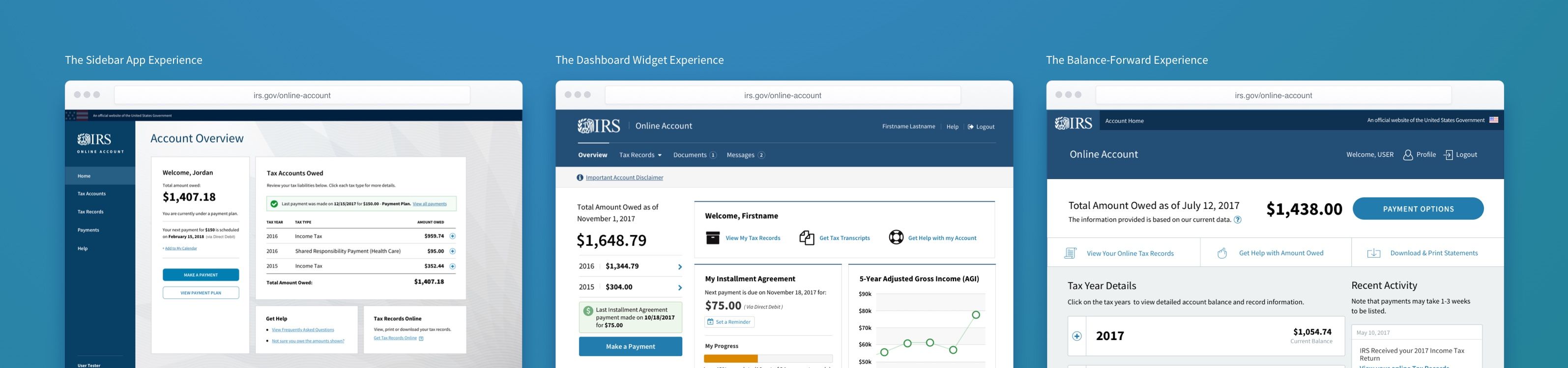
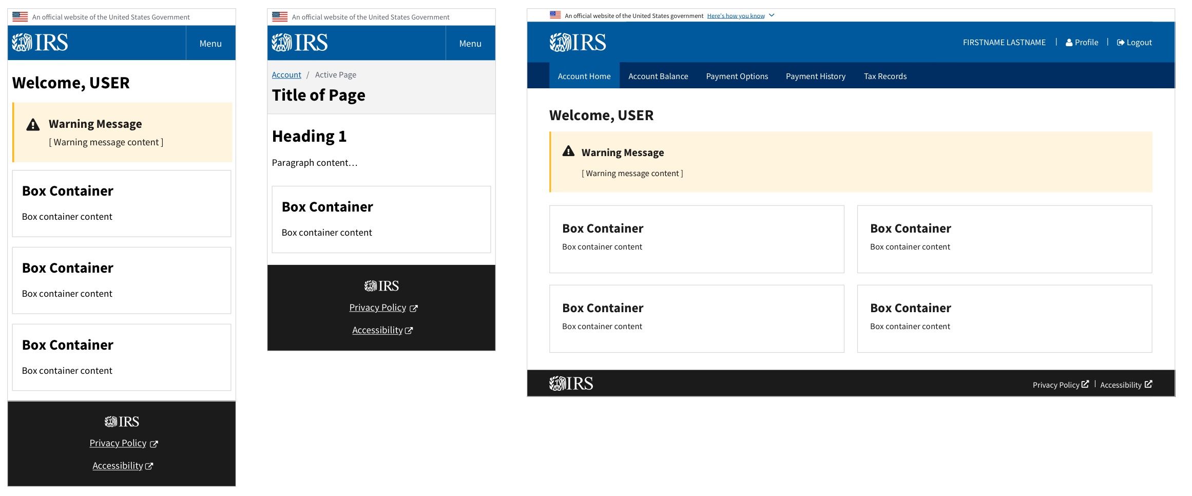
Early Multi-page Concepts
Below are a few concepts I contributed during the Discovery phase. Other designers had contributed designs that were user tested as well but are not shown here.
Production & Delivery
With the core hypotheses validated and overall design direction narrowed down it was time to enter into production mode. Dozens of user stories were created and my design team had to work quickly in order to meet an aggressive MVP schedule.
Design Deliverables
For each user scenario we created task flows, wireframes, high-fi mockups, and prototypes. We reviewed our designs with 508 specialists, developers, business analysts, and product managers multiple times a week. Anything that was complex or risky we continued to user test.
Taskflows

These are taskflows I created to capture high-level steps for navigating through the application.
Wireframes

I created low-fidelity wireflows (desktop and mobile) and shared with multiple stakeholders early and often.
High-Fidelity Mockups
I created high-fidelity mockups and templates for myself and other designers to use.
User Testing

I created several InVision prototypes (low-fi) that we tested in front of actual taxpayers.
OLA Design Guide (a mini design system)
We quickly realized that there wouldn't be enough time to provide detailed design specifications for all the hundreds of screens we had modeled. I came up with a solution to provide developers with component-level specs rather than red-lining every single screen.
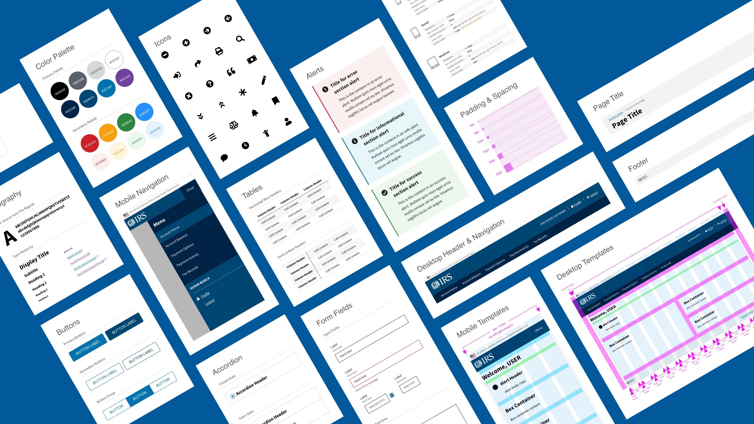
At the time, the IRS didn't have an enterprise-wide design system so I created one in the matter of a few week's time. It didn't include html/css/js code, design tokens, or live working examples but it did provide essential guidance to developers for things like the typographic system, spacing units, color palette, responsive grid, and core UI components and patterns.
It turned out to be a huge win for both designers and developers and ensured our production schedule didn't slip.
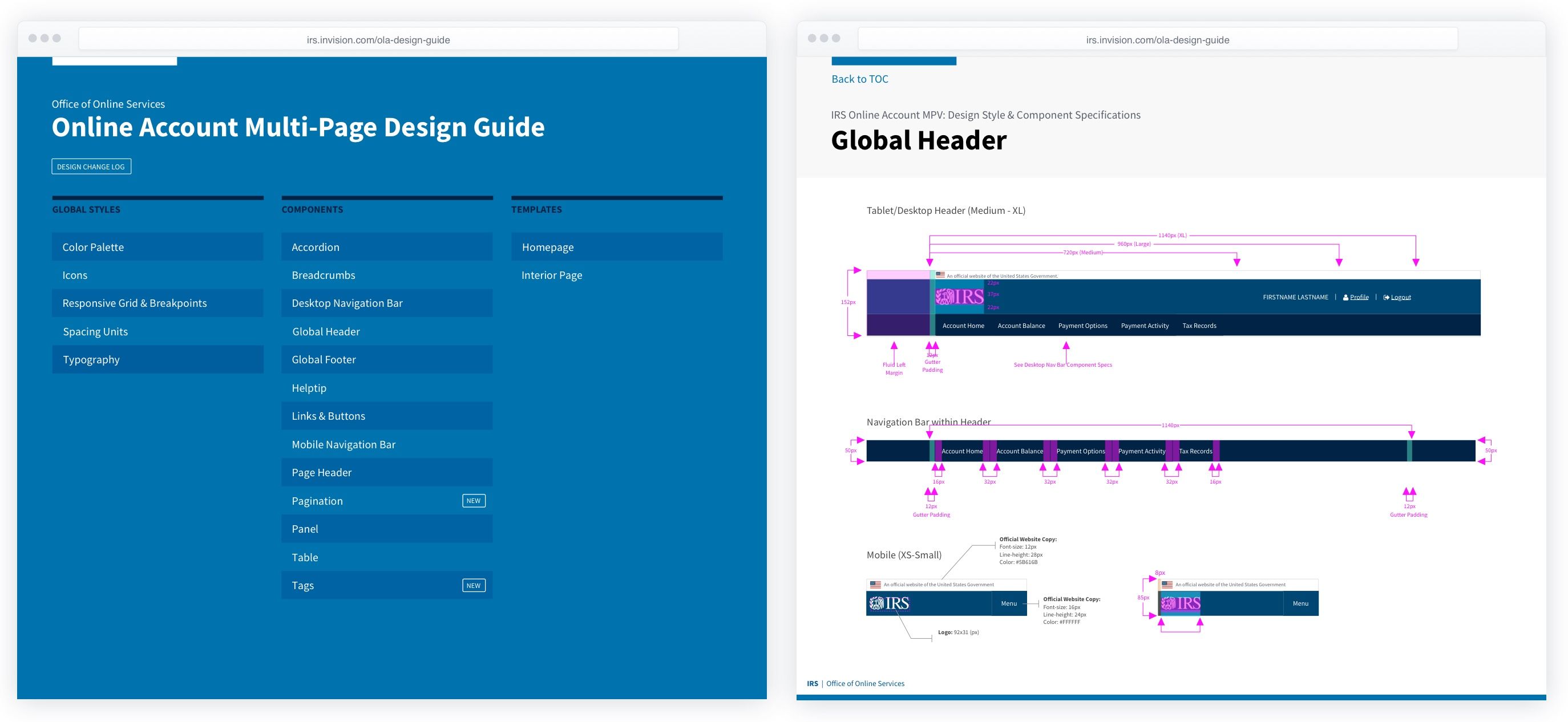
I published the design guide as an InVision project and shared with developers.
Final Solution

Recap of My Contributions to this Project
- Facilitated design workshops and brainstorming sessions
- Created several design hypotheses and concepts during Discovery
- Worked closely with our research team to create the test stimulus, test objectives, and contributed to the moderator guides
- Created the new information architecture and site map
- Provided art direction & UX guidance to other designers for design work they contributed
- Created high-fidelity screen mockups and coordinated designs with 508, product, and business teams
- Created a mini design system with detailed specifications at the component level to help streamline design hand-off to developers
Lessons Learned
- Share work with developers earlier and more often (even during concepting).
- Share designs with execs and solicit their input sooner.
- Stop creating red-line specs for every screen. Let the design system communicate as much as possible.